Milford, Connecticut – 17 July 2017 –
The new Subway ‚fresh forward design‘ should transforming every aspect of the customer experience. Subway engaged FRCH Design Worldwide to design a distinctive and welcoming space. A bright new color palette, inspired by fresh vegetables, and the new Choice Mark serve as a focal point in the new space.
Highlights include:
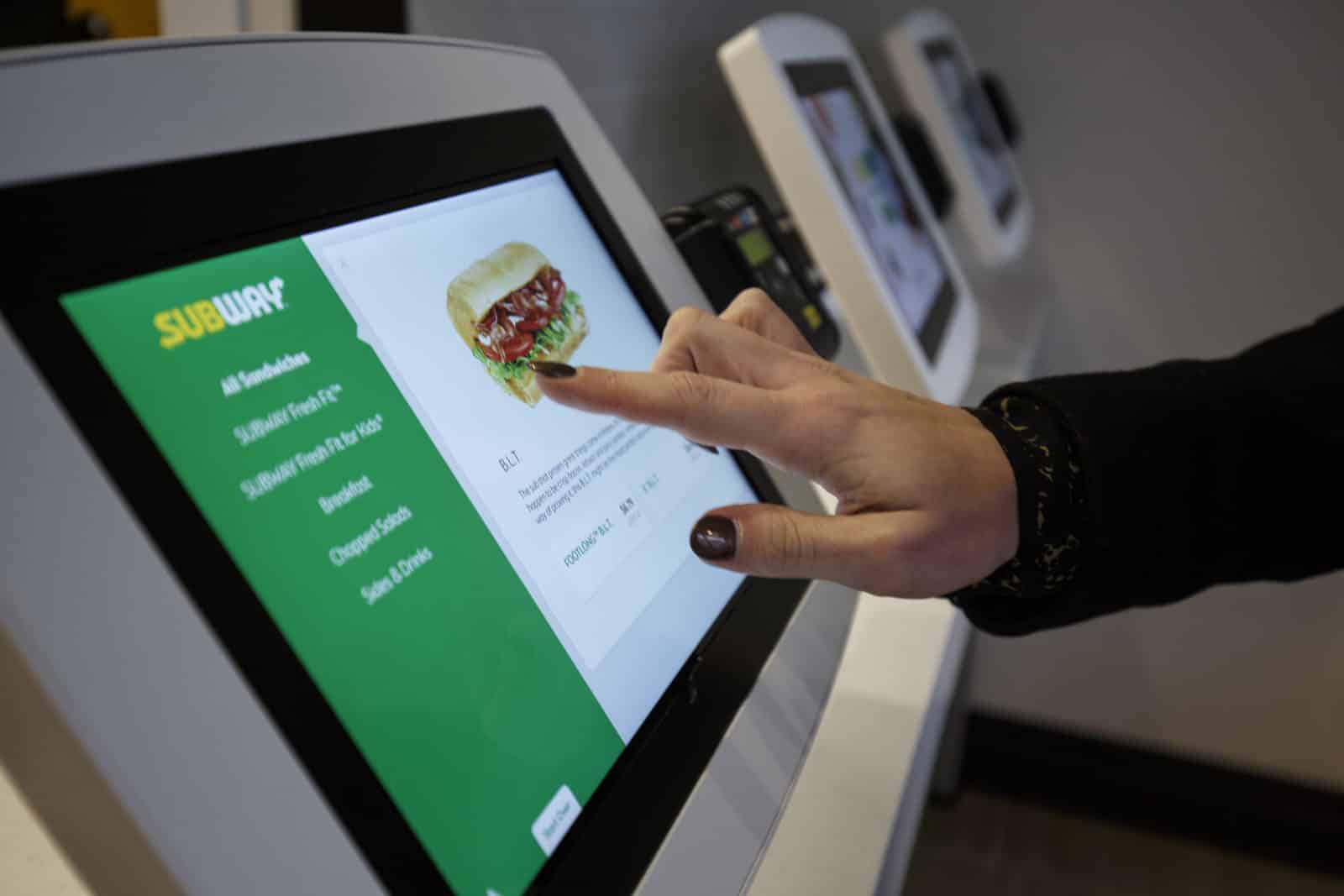
- Digital: Self-order kiosks in select locations, digital menu boards and, as always, Apple and Samsung Pay options. Guests enjoy a speedy Subway experience with a separate food preparation area and a designated pre-order pick-up location for kiosk, mobile app, delivery, catering and bot for Messenger orders.
- Food: Fresh veggie display with whole tomatoes, green peppers, onions and cucumbers that are sliced daily, plus new bread and cookie displays on the front of the line. Subway Fresh Forward restaurants also include new menu items, starting with pico de gallo, new sauces, house-made pickles, and made-without-gluten bread.
- Dine-In Experience: Bright and playful décor, curated music, and comfortable seating with USB charging ports and complimentary Wi-Fi create a welcoming environment.
The new restaurant design is the next phase of Subway’s evolution. The company created Subway Digital in 2016 to develop an omni-channel strategy. Subway also revealed a new brand identity, designed by Turner Duckworth New York, including an iconic logotype, new symbol called the Choice Mark and optimized color palette that is brought to life through bright and bold new imagery, new packaging, uniforms and signage, which started rolling out this spring in North America. Many elements of the new brand identity will be worldwide by the end of 2017.


